


If your retention graph keeps falling and you can't tell why, read its shape before you look at the final percentage. In one of AIR Media-Tech's channel audits, two videos on the same topic, both about six minutes long, ended at 41% and 34% watched. What differed was how fast each one got to the point: within the first 15 seconds in one, at 1:43 in the other.
So we went through YouTube's help pages on the retention report, AIR Media-Tech's data, and our channel audits, and put together what a creator needs before touching the edit: where to find the graph, the four shapes to look for and what each one points to, what spikes mean, and how to check your last 5 videos at once.
Most retention problems show up as one of four shapes: an intro cliff, a slow mid-video decline, a sudden cliff, or an end-of-video drop-off. Each shape points to a different part of the video, so read the shape before you look at the final percentage. Fix them in this order:
|
Pattern |
What it looks like |
What it usually means |
Where to look |
Fix priority |
|
Intro cliff |
The steepest drop on the graph, in the first 15–30 seconds |
The opening doesn't confirm what the title and thumbnail promised |
First 5–30 seconds, next to the title and thumbnail |
1 |
|
Sudden cliff |
A sharp drop at one timestamp, then a flat line again |
One segment pushed viewers out: a sponsor read, a tangent, an abrupt topic switch |
The 10–15 seconds before the drop |
2 |
|
Slow mid-video decline |
A steady slope with no single break |
Flat pacing, no new reason to stay, or a video longer than its topic |
Runtime, script outline, section lengths |
3 |
|
End-of-video drop-off |
The line falls hard in the last 30–60 seconds |
Viewers sensed the ending before it came |
Wrap-up lines, where the payoff and CTA sit |
4 |
How to Find Your Retention Graph in YouTube Studio, and What the Gray Area Shows
Open your YouTube Studio, go to Content, click Analytics on a video, and open the Engagement tab. The audience retention report sits there and on the Overview tab. It works per video only, so there’s no single graph for the whole channel.
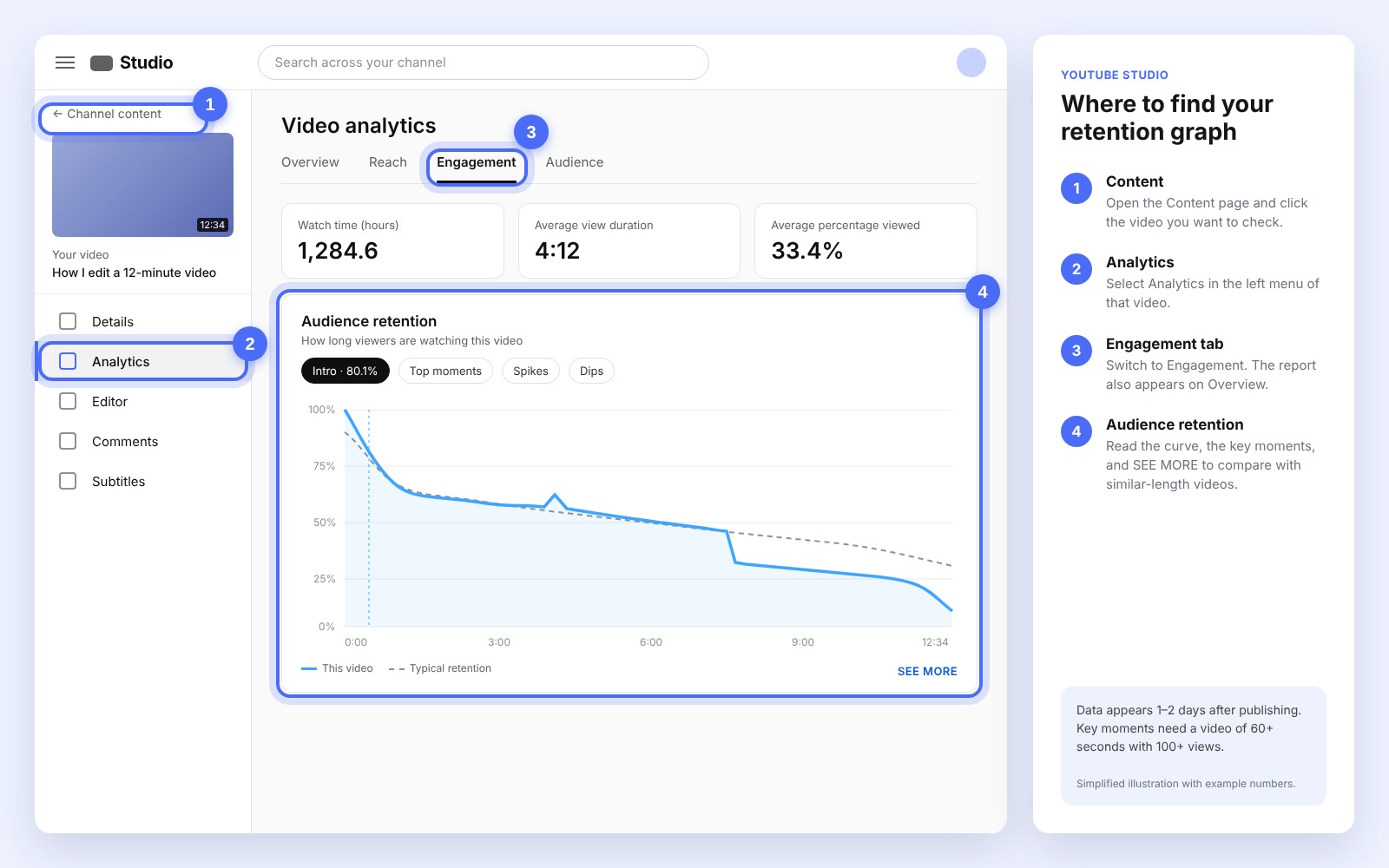
There are three limits, straight from YouTube’s audience retention guide:
- New data takes 1–2 days to appear.
- Key moments show up only on videos that are 60 seconds or longer and have 100+ views.
- A moment is labeled only if YouTube detects it, so a graph with no labels isn't broken.
One more thing to keep in mind: since August 24, 2026, YouTube counts a view from the first frame, but it still calculates retention, AVD, and CTR on engaged views, the same way as before. So if your view count jumped after that date, the retention graph won’t jump with it.
The graph gives you two readings:
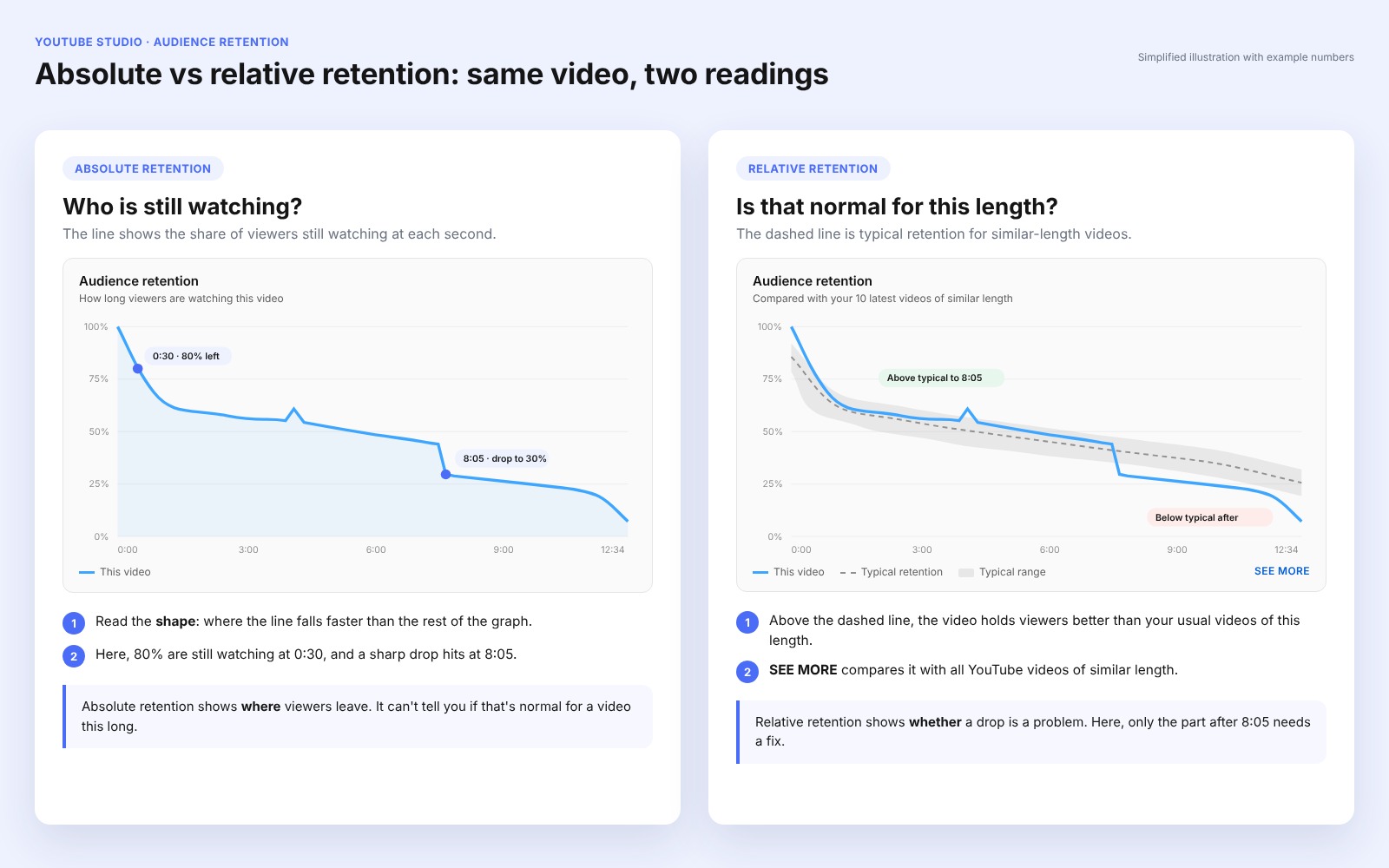
- Absolute retention is the line itself: the share of viewers still watching at each second.
- Relative retention is how the video compares with others. Click SEE MORE to compare it with all YouTube videos of similar length, or check the typical retention line, which compares it with your own 10 latest videos of similar length.
Check relative retention before you call a curve bad. A steep line that still beats similar-length videos is normal for the format, and the problem usually sits somewhere else, most often in packaging. An audit by AIR Media-Tech found this on a large kids' music channel: 22 of its videos got 100,000+ impressions in 28 days and kept viewers for 40% or more of their length, but their click-through rate stayed under 2%. Those videos held their audience well. The title and thumbnail weren't winning the click.
In AIR Media-Tech's data from 21,755 long-form videos on 302 channels published in 2025, the median video keeps 38% watched at 3–5 minutes, 30% at 5–15 minutes, 26% at 15–60 minutes, and 17% past an hour. Only the top quarter clears 46%, 41%, 33%, and 25%. That's lower than the 50–70% many guides quote for short videos. A 30% APV on a 60-minute video still means 18 minutes of real viewing per view.
YouTube also labels four key moments on the graph:
- Intros: the share of viewers still watching after the first 30 seconds
- Top moments: stretches where almost no one dropped off
- Spikes: moments viewers rewatched or shared
- Dips: moments viewers skipped or where they stopped watching
Can't tell why viewers leave your videos? Check your channel for free
The Free Channel Check reads your YouTube Studio data, shows what stands out, and ends with a plan of what to fix first. It takes about 5 minutes.
Check my channel for free →Four Retention Graph Patterns, Four Different Places to Look
Every video loses viewers as it plays, so a falling line on its own means nothing. Look for the place where the graph falls faster than the rest of it, and match that shape to one of the four below:
The Intro Cliff
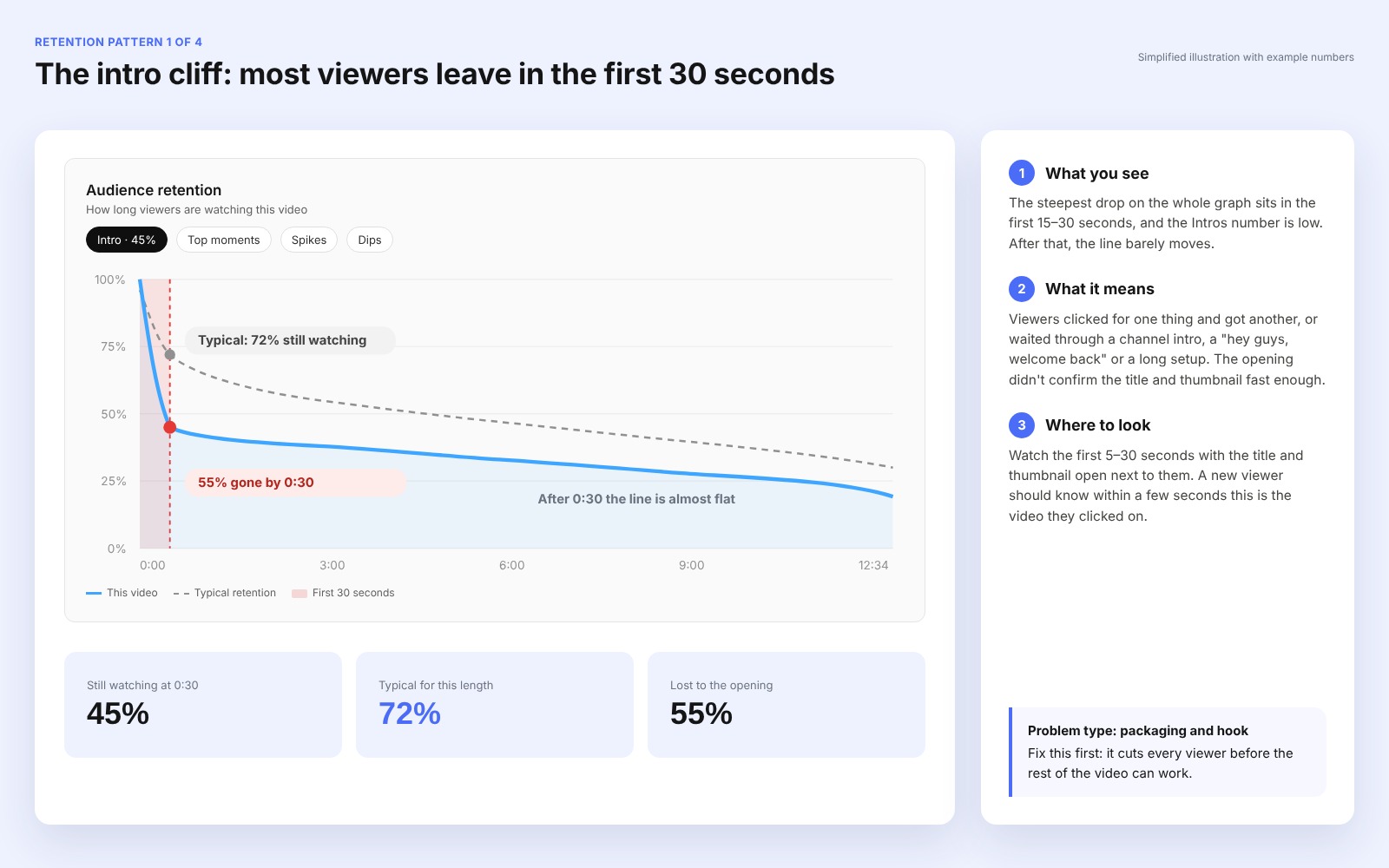
What you see: the line drops harder in the first 15–30 seconds than anywhere else, and the Intros number sits below 50%. That’s the line YouTube itself uses. In the Content tab of YouTube Studio, videos with 50% or more of the audience still watching after the 30-second mark go into the “above typical intros” list. Many guides quote 60–65%, which is higher than YouTube’s own mark.
What it means: the title and thumbnail made a promise, and the opening didn’t confirm it fast enough. Or the video spends its first minute on setup: a channel intro, a long greeting, background before the point.
An audit by AIR Media-Tech compared two videos on one educational channel: the same topic, both about six minutes long. The one that answered its question in the first 15 seconds kept viewers for 41.3% of its length on average. The one that got to specifics at 1:43 kept them for 33.8%. Across the channel, the audit saw the same split: videos that made their point in the first 5–15 seconds held above 38%, and videos that spent a minute or two on context fell below 30%.
Two videos on one educational channel: same topic, about six minutes each (AIR Media-Tech audit)
Specifics arrive at 1:43
33.8%
of the video watched on average
Answer in the first 15 seconds
41.3%
of the video watched on average
That's +7.5 points of the video watched, from getting to the point sooner.
Where to look: watch the first 5–30 seconds with the title and thumbnail open next to them, and note the second where the video says what it’s about. If that’s past the 15-second mark, start there. To fix the opening, see our guide to retention editing patterns.
The Slow Mid-Video Decline
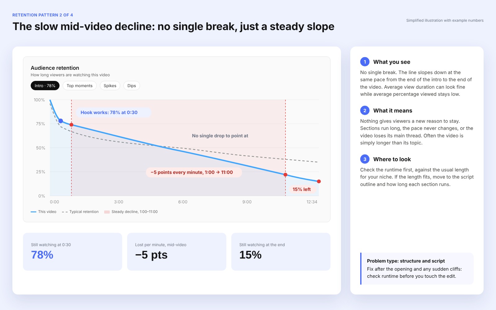
What you see: no single break, just a steady slope from the end of the intro to the end. Every video slopes down a little, so this is a problem only when the line stays below the gray typical-retention area for most of the video. Average view duration (AVD) can look fine while average percentage viewed (APV) stays low.
What it means: nothing gives viewers a new reason to stay. Sections run long, the pacing feels off, or the video loses its main thread.
Where to look: check the runtime first. A slow decline often means the video is longer than its topic. A kids’ toy channel that AIR Media-Tech works with held only 8–12% APV on 28-minute compilations. After it switched to shorter compilations, APV rose to 16.4-22%, and recommendations grew from 67.3% to 75% of its views.
If the length already fits your niche, move to the script outline and section lengths. An audit by AIR Media-Tech found this pattern on a brand channel that teaches online sellers. Its videos over 10 minutes ran at one even pace, with no change between blocks, and kept viewers for only 16–23% of their length. The slide started between minutes 3 and 10.
The Sudden Cliff
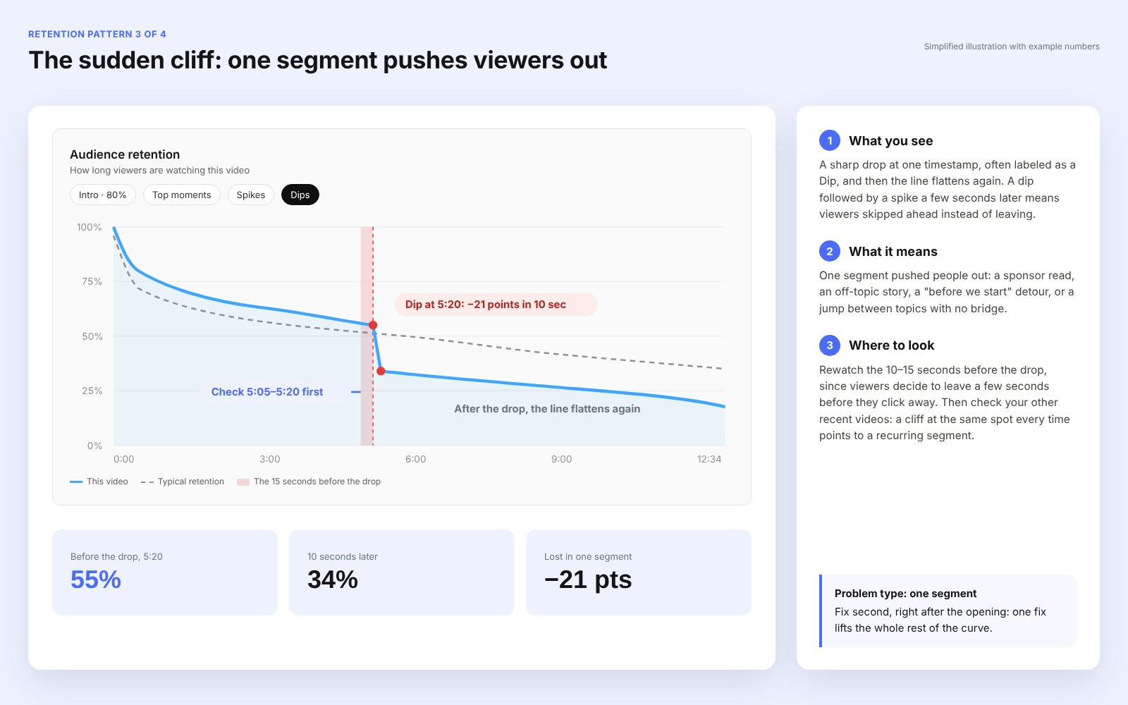
What you see: a sharp drop at one timestamp, often labeled as a Dip, and then the line flattens again.
What it means: one segment pushed people out. The usual causes are a sponsor read, an off-topic story, a "before we start" detour, or a jump between topics with no bridge. A dip followed by a spike a few seconds later means viewers skipped ahead instead of leaving. That segment is skippable, and the rest of the video is holding.
Where to look: rewatch the 10-15 seconds before the drop, because viewers decide to leave a few seconds before they click away. Then open your other recent videos. If the cliff lands at the same spot in each one, a recurring segment is the cause, like a sponsor slot always placed at 1:30.
The End-of-Video Drop-Off
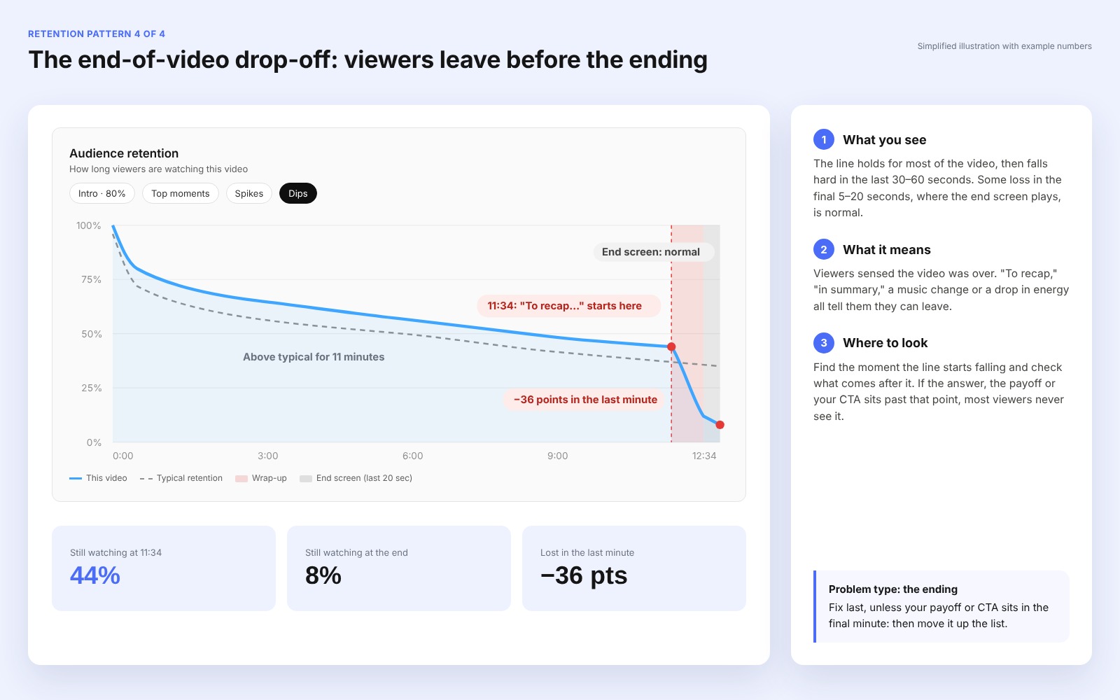
What you see: the line falls hard in the last 30-60 seconds.
What it means: viewers sensed the video was over. "To recap," "in summary," a music change, or a drop in energy all tell them they can leave. Some loss in the last 5-20 seconds, where the end screen plays, is normal. A drop that starts a minute or more before the end is the one to fix.
Where to look: find the moment the line starts falling and check what comes after it. If the answer, the payoff, or your CTA sits past that point, most viewers never see it. Then check your end screens. If they bring in almost no views, the viewers you lose at the end also leave your channel. In AIR Media-Tech's audit of a brand channel that teaches online sellers, end screens brought in just 0.11% of its views.
What Spikes on Your Retention Graph Mean, and When They’re a Problem
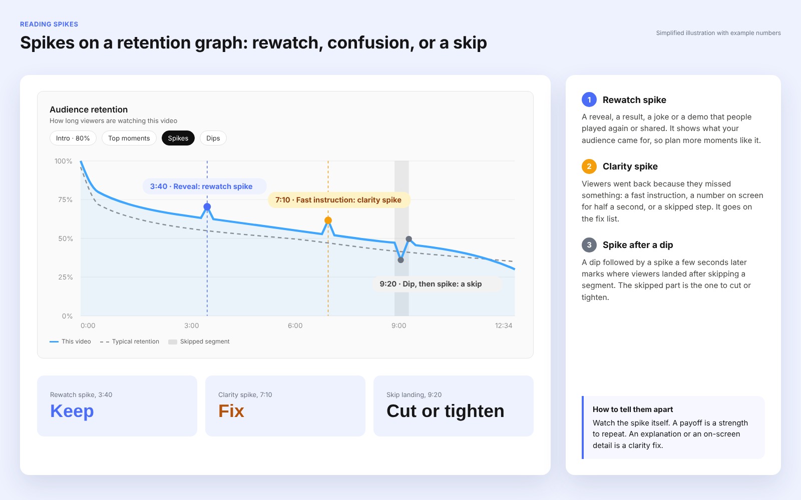
A spike marks a part of the video that more people watched than the part before it. YouTube names two opposite reasons:
- The moment is worth rewatching. A reveal, a result, a joke, or a demo that people played again or shared.
- The moment is unclear. Viewers went back because they missed something: a fast instruction, a number on screen for half a second, or a step the video skipped.
To tell them apart, watch the spike itself. A spike right after a dip is a third case: it marks where viewers landed after skipping a segment.
Rewatch spikes show what your audience came for. Clarity spikes go on the fix list. If the line climbs above 100% at some point, more views covered that moment than started the video, because people replayed it. That’s the strongest rewatch spike you can get, and it shows up most often on Shorts and short tutorials. Our glossary explains how replays push retention past 100%.
What to try
Write down the rewatch spikes from your last 5 videos with one word each: reveal, result, joke, demo. The word that repeats is the type of moment to plan more of in your next script.
How to Audit Your Last 5 Videos and Find the Drop That Keeps Repeating
One graph shows what went wrong in one video. Five graphs show whether the problem is your channel's habit. Run this check before you change anything in the edit:
- Open the retention graph for your last 5 long-form videos. Note the Intros number and the timestamp of the biggest drop for each.
- Label each graph with its main pattern from the table above.
- Count the repeats. An intro cliff in 3 or more of the 5 videos is a hook or packaging habit, and fixing one video won't change it.
- Check fixed timestamps. If a sudden cliff lands near the same minute every time, watch that minute in each video and find what they share.
- Compare with relative retention. If a video beats similar-length videos in SEE MORE, its graph is normal for the format. Look at packaging or traffic instead.
Then split the graph by audience. The Segments menu compares new and returning viewers and subscribers with non-subscribers. In Advanced Mode, compare average view duration by traffic source. Search viewers come with a question and often leave once it's answered. Viewers from Suggested and Browse come without one, so an intro cliff usually hits them hardest. If only one group shows the drop, fix it for that group first.
Here's a sheet you can copy for the five videos:
|
Video |
Intros (30 sec) |
Biggest drop |
Main pattern |
Repeats? |
|
Video 1 |
||||
|
Video 2 |
||||
|
Video 3 |
||||
|
Video 4 |
||||
|
Video 5 |
What to Fix First, Based on the Pattern
The YouTube retention graph shows where viewers leave. The reason sits in the video itself, so treat each pattern as a place to look. A repeated intro cliff sends you back to the title, thumbnail, and first 15 seconds. A curve that beats your typical retention while views stay low points to packaging. Slow declines, sudden cliffs, and early endings send you to the edit, and our guide to retention editing and cutting patterns covers those fixes. To check whether your numbers are low for your video length, see our breakdown of watch time, AVD, and APV, with benchmarks by length.
Found the drop, but not sure what's causing it on your channel?
A Full Channel Audit compares your Studio data with 3 channels you choose, shows where viewers leave and why, and ends with a ranked plan of what to fix first.
- All 10 analytical blocks, from packaging and retention to monetization
- Your retention patterns next to 3 channels you choose
- Every fix ranked by effort and expected impact
- Read-only Studio access, no revenue share, no network contract