01
Mistake 1: Overcomplicated Thumbnails
02
Mistake 2: Ignoring Mobile Design
03
Mistake 3: Inconsistent Visual Identity
04
Mistake 4: Forgetting the “Viewer’s Journey”
05
Mistake 5: Overlooking End Screens and Cards
06
Mistake 6: Non-Existent Intros and Outros
07
Mistake 7: Prioritizing Design Over Substance
08
Why YouTube Channel Branding Matters
09
Final Thoughts

You’ve got great content. Your storytelling is on point. You upload consistently. Yet, your channel’s CTR is stuck. Sound familiar? Don’t worry—we know how to fix this.
The right YouTube channel art can make all the difference. At AIR Media-Tech, we’ve helped redesign hundreds of channels and seen CTR jump from 2% to 6%, from 4% to 7%, and beyond. If your videos get 20K views, then a +2% to CTR means hundreds of extra clicks. If 100K views, it means thousands.
Let’s break down common design mistakes—even seasoned creators make them—and how they might be quietly stalling your growth.
Mistake 1: Overcomplicated Thumbnails
If your YouTube thumbnails look like a collage of every idea you had, they’re doing more harm than good. Too much text, too many colors, or overcrowded visuals confuse viewers instead of attracting them.
The cautionary tale: One creator’s travel channel had incredible footage of exotic locations, but their thumbnails featured five different fonts, clashing colors, and unnecessary stickers. They thought “more” would grab attention, but their metrics said otherwise.
How to fix it: Simplicity wins. Your YouTube thumbnail design should convey a single, clear emotion or idea. Use contrast and minimal text to guide the eye. Test variants—sometimes swapping red for yellow or removing text entirely can boost clicks.
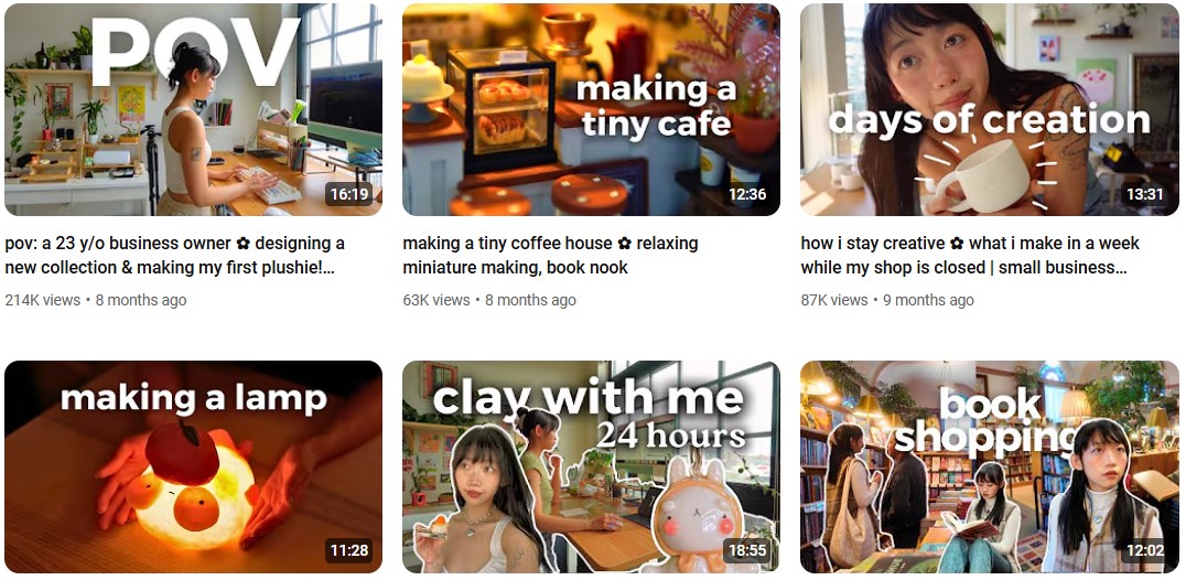
Ucomfy (496K) has a very simple approach to her thumbnails. Often it’s just a picture of her plus a short, but striking phrase:
AIR Media-Tech has helped hundreds of channels improve their design, turning simple video blogs into strong personal brands. Our experts focus on creating visuals that leave a lasting impression on your audience. Contact us to get started!
Mistake 2: Ignoring Mobile Design
Over 70% of YouTube watch time happens on mobile, yet so many creators design for desktops. Small text, crowded thumbnails, and illegible banners cost you views and subscribers.
Example: A lifestyle vlogger’s banner text and thumbnails looked fine on a computer but turned out unreadable on mobile. Their mobile viewership dropped significantly because viewers couldn't see what was depicted in images.
How to fix it: Always preview your designs on the phone before publishing. Create with small screens in mind—that means larger fonts, fewer elements, and clear and visible CTAs. Use responsive YouTube banner templates to ensure compatibility across devices.
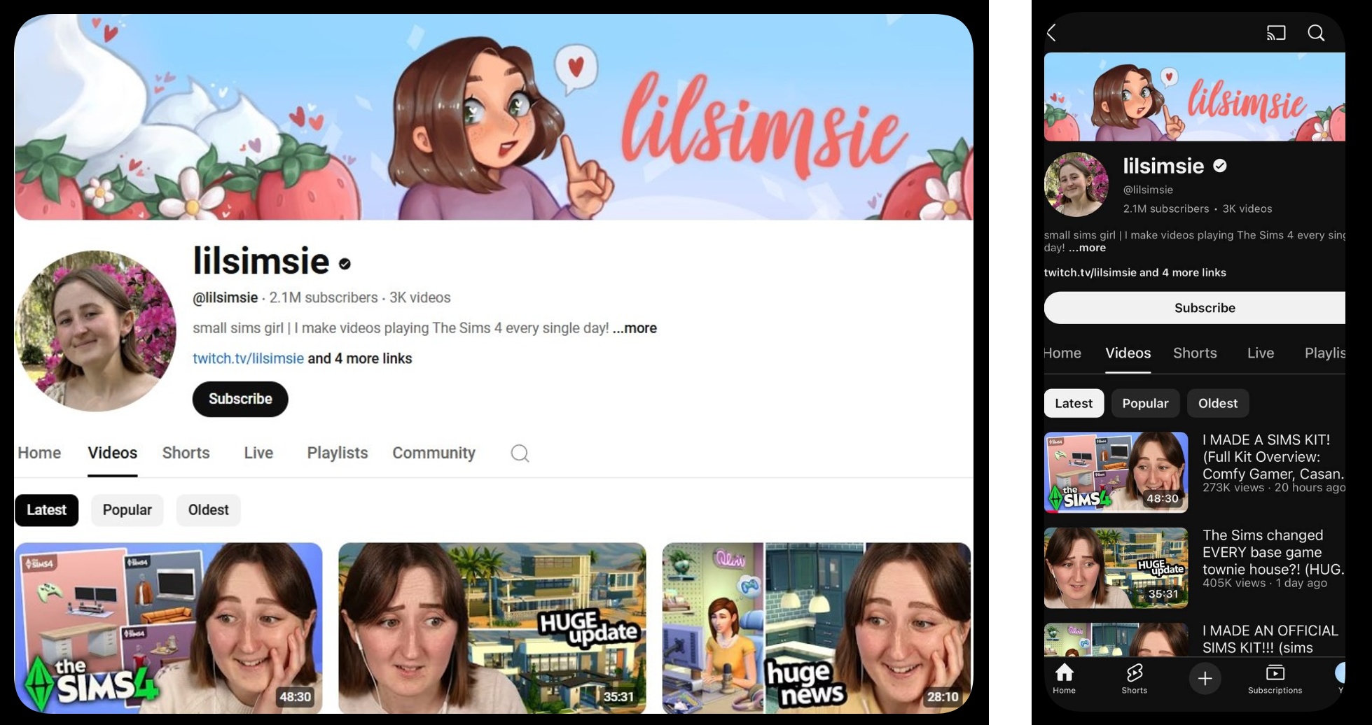
Take the example of lilsimsie, a streamer with 2.1 million subscribers. Her YouTube channel art and thumbnails look great on both computer and mobile devices and with both light and dark themes:
Mistake 3: Inconsistent Visual Identity
You’ve seen those channels where every thumbnail looks like it belongs to a different creator. Maybe one video uses bright neon colors, and the next opts for muted pastels. That’s visual chaos.
How to fix it: Develop a design system. Choose a consistent color palette, font, and layout style, and stick to it. This doesn’t mean every thumbnail should be identical—just cohesive enough that viewers instantly recognize your work. Your YouTube logo design should also align with this identity for a better effect.
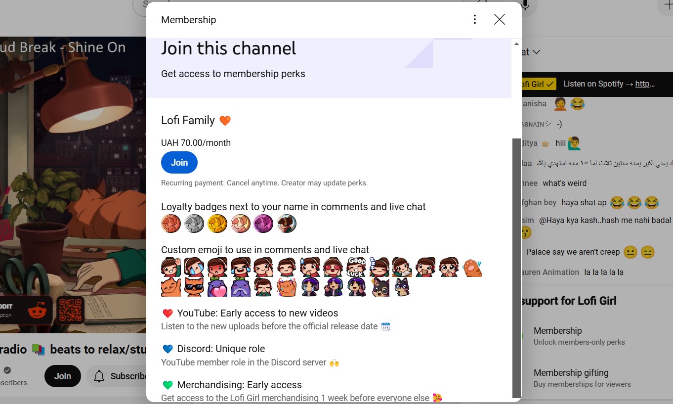
For example, notice how the channel Lofi Girl (14.7M) uses the same cartoon character in their design to build recognition:

Also, YouTube Memberships and Super Features play a crucial role not only in your overall channel branding but also in engaging your loyal audience. Those should reflect your essence as a creator and excite your subscribers. Customized badges, perks, and icons that align with your style can boost loyalty and make your offerings more appealing. AIR Media-Tech can help you create these designs, ensuring they captivate your audience and strengthen your connection. Feel free to reach out!
Mistake 4: Forgetting the “Viewer’s Journey”
Great design doesn’t just make your channel look good—it guides your audience through a journey. But too many creators don’t think about how their channel’s design aligns with viewer behavior. Sometimes creators pour effort into their homepage banner while neglecting playlists. Visitors land on their page, don’t know where to start, and leave.
How to fix it: Design your channel layout with intention. Use your homepage to feature playlists that cater to different types of viewers—first-timers, binge-watchers, or niche enthusiasts. Add custom thumbnails to playlists and organize them logically. Make it painfully easy for viewers to find their next watch.
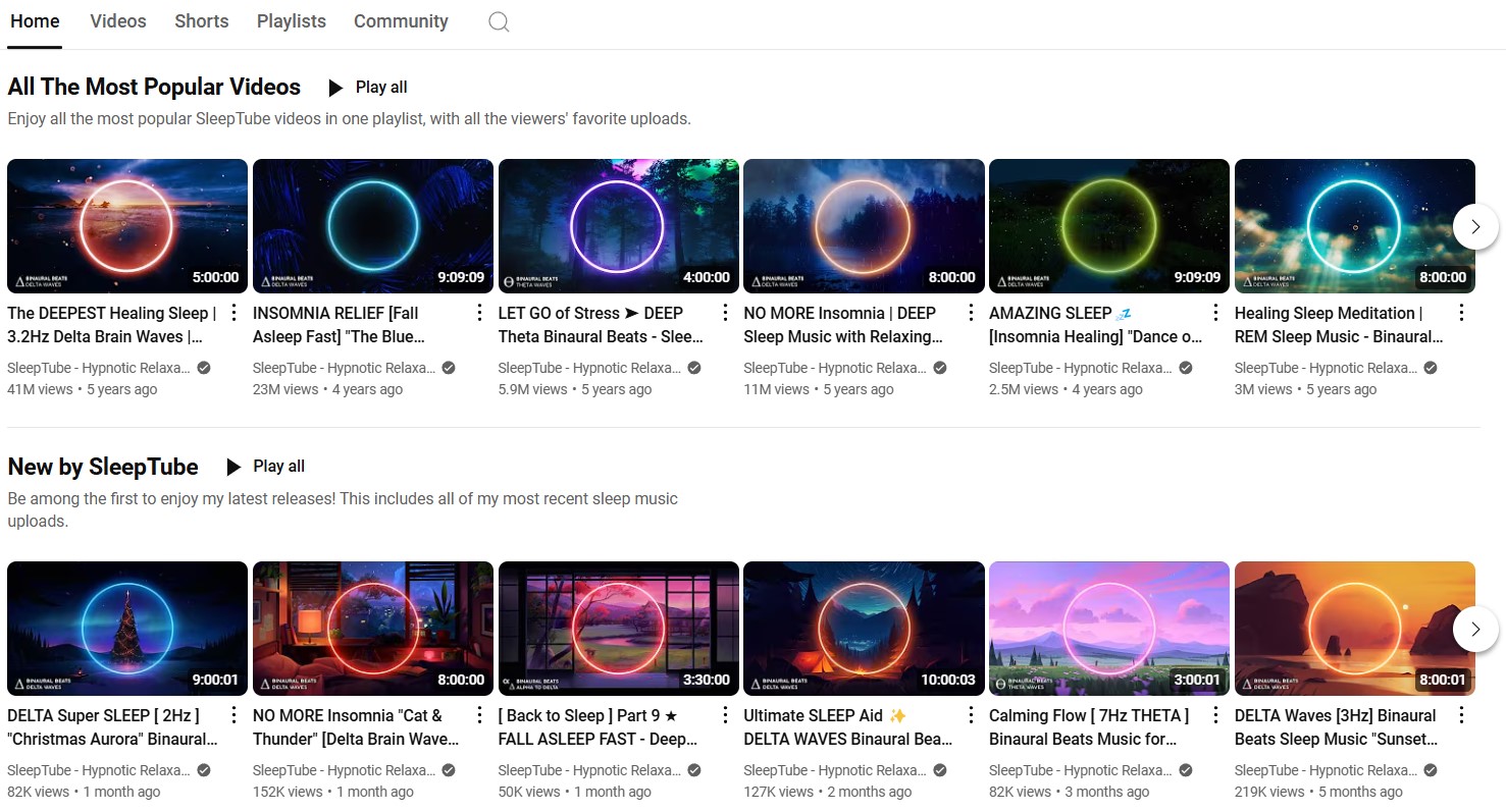
The channel with relaxing sounds SleepTube (908K) uses a simple neon circle in their design as a signature feature that differentiates them from countless other sleep music channels. Also, look at how they leverage playlists on the home page to guide newcomers:
AIR Partners Hit 125+ Billion Views
Looking for a boost? Get an expert YouTube channel audit to unlock hidden growth spots!
Mistake 5: Overlooking End Screens and Cards
Your video’s ending is a key spot for boosting engagement, yet many creators slap on generic end screens or forget them altogether, missing out on thousands of potential subs.
How to fix it: Design end screens with clear, clickable elements. Use enticing visuals and reinforce your CTAs with matching text styles and colors. Cards should be strategically placed—not random interruptions—and designed to add value without feeling intrusive.
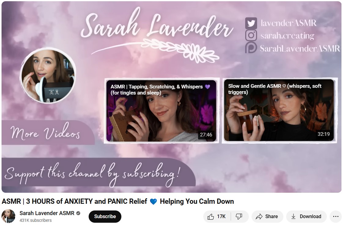
Let’s analyze this perfect example on the channel Sarah Lavender ASMR (431K):
Mistake 6: Non-Existent Intros and Outros
Intros, outros, and animated transitions are critical for both branding and engagement. When used effectively, these elements create a polished viewer experience and reinforce your channel’s identity. They also play a vital role in boosting engagement by capturing attention early and leaving a lasting impression.
Notice how TED-Ed‘s 5-second-long animated intro makes their video look much more professional:
AIR Media-Tech specializes in creating sleek, on-brand animations that capture attention without overwhelming the viewer. With expert help, these elements can boost retention, enhance professionalism, and strengthen your brand’s identity. Contact us to transform your channel!
Mistake 7: Prioritizing Design Over Substance
Finally, some creators go too far in the opposite direction, focusing so much on aesthetics that their content takes a back seat. No amount of polished design can mask videos that don’t deliver value.
How to fix it: Think of design as an amplifier, not a replacement. If your content isn’t delivering, no amount of polish will help. Start with value, then use design to showcase it effectively.
Why YouTube Channel Branding Matters
YouTube channel branding is critical for:
Increasing CTR
If you have 500K impressions with a 4% CTR, that's 20K clicks. If your CTR increases to 8% with the same 500K impressions, you will get 40K clicks, easily doubling your views. The redesign directly impacts how many of those impressions convert into views, ultimately driving more traffic and engagement to your channel.
Building Recognition
Consistency in your visuals—from your YouTube banner to your thumbnails—helps viewers recognize you by your style, decreasing the chances of them scrolling past you. Even if a new audience doesn’t click on your first video, seeing your content repeatedly builds familiarity. Over time, this increases the likelihood they’ll click when your videos appear again.
In short, a brand-consistent design isn’t just about aesthetics—it’s a powerful way to boost your CTR.
Standing Out in a Crowded Space
With millions of creators on YouTube, standing out isn’t just a bonus—it’s a necessity.
Guiding Viewer Expectations
Clear branding informs your audience about the kind of content you offer. Whether it’s tutorials, entertainment, or reviews, effective visuals set the right expectations, reducing confusion and attracting the right viewers.
Improving Viewer Engagement
Thoughtful branding isn’t just about aesthetics—it’s a tool for guiding behavior. A cohesive design encourages clicks, longer watch times, and subscriptions.
Final Thoughts
Your channel’s design sets expectations, builds trust, and turns casual viewers into loyal subscribers. To avoid any design mistakes, check out our Design & Animation services. The creative AIR team will transform your channel’s art, including banners, thumbnails, intros, and outros, making it truly stand out.
We know that true channel growth happens when great content meets eye-catching design.