


Not Sure Which Languages to Choose?
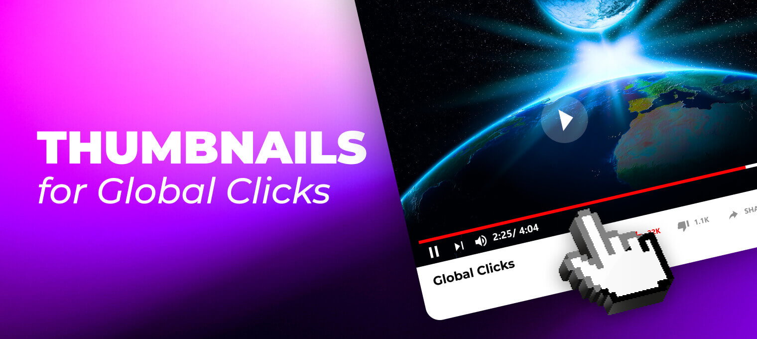
YouTube now lets you do two important things: test thumbnails against each other with A/B testing, and show different thumbnails to viewers in different languages when you use multi-language audio.
Together, these change how you think about thumbnails. Before, you had one image for everyone. Now, you can have multi-language thumbnails on YouTube that match each language and culture, while still keeping one video and one channel.
Let's talk about how to keep things readable in different languages. And how to avoid common design mistakes that quietly kill your global performance.
Why Multi-language Thumbnails are Important Now
Your thumbnail and title drive CTR. If those don’t work, nothing else matters.
When you add multi-language audio and translated metadata, you’re asking for more clicks from new countries. But if people in those countries still see an English-only thumbnail or a messy collage of elements, they don’t feel that the video is “for them”.
That’s where localization through thumbnails is a must-have. You can:
- Localize text on thumbnails per language.
- Or, in some cases, remove most of the text and let visuals carry the story.
Both options can work. The trick is knowing when each one makes sense.
Visual-first Thumbnails: When Images are Better than Words
A strong thumbnail works even if you blur it or see it from far away on a TV. The viewer should still understand the main idea: excitement, problem, conflict, result, and emotion.
Visual storytelling thumbnails are strongly important when:
- The topic is emotional or obvious from the image (fear, joy, surprise, success, failure).
- The viewer already knows you, so they just need a clear scene and your face.
- You are publishing in many languages and don’t want to fight with text expansion in every one.
Example: a creator does a video called “I tried living with only my phone for 7 days”.
One option: large English text “7 DAYS, 1 PHONE” plus the creator looking stressed.
Visual-first option: close-up of the creator’s tired face, lots of notifications on screen, phone in hand, no text at all, or just a very small label.
If you want to reach viewers in Spanish, Portuguese, Arabic, and Hindi with the same upload, еry both options. We’ve seen the second option outperform the first one many times, but definitely not always.
This is the core idea of a visual-first thumbnails strategy: make a thumbnail that still works if you remove all copy. Then only add text where it clearly adds something.
When Text is Necessary (and How to Keep It Under Control)
Now the other side. Sometimes you do need text.
If your video is about tutorials, news, money, rules, or “how-to” content, text builds trust. People want to know exactly what they’re clicking on. Visuals alone are not always enough.
For example, a video about “new YouTube tax changes for 2025” likely needs some text. It can’t just be your face and a graph. In these cases, text vs no-text thumbnails are about clarity.
The problem starts when the same long English phrase is translated into German, Spanish, or French, and you try to force it into the same box. Some languages take more space. Some use longer words. The result is:
- Tiny unreadable text on mobile.
- Text is glued to every edge of the thumbnail.
- Viewers see a noisy block instead of a clean message.
If you want multilingual thumbnail optimization that actually works, think of text like a limited resource. Work backwards from the design:
- How many words stay readable on mobile?
- How big can the font be without covering the main objects or faces?
- Does this text really need to be in the thumbnail, or is it already in the title?
Often, the right move is to shorten the message in every language. Not “translate the sentence”. Instead: “capture the promise”.
English: “New YouTube Tax Rules”
Spanish: “Nuevos impuestos YouTube”
German: “Neue YouTube-Steuern”
Short, clear, not a full sentence. That’s what thumbnail text localization should aim for.
Mistake #1: Trying to Show Everything at Once
One of the most common design mistakes we see is overcomplicated thumbnails:
- Too many photos.
- Too many stickers.
- Too many colors.
- And then text added on top of all that.
On one channel, we saw five fonts, three emojis, two logos, multiple screenshots, and a long sentence in every frame. On the desktop, it kind of made sense. On mobile, it looked like noise.
When you move into multi-language thumbnails on YouTube, this gets worse. Each language adds more text. Some teams add more symbols or flags to “make it clear” for each country. The result is total overload.
Simple rule: every extra element fights for attention. If you add text in multiple languages, reduce everything else.
Clean background, one main subject, one strong emotion or symbol, and a very short line of text if needed.
If your thumbnail looks like an infographic, it’s already too busy.
Thumbnails not converting globally?
Let us fix your visuals and grow your CTR. Contact us today.
Mistake #2: Designing Only for Desktop
Most views come from mobile and TV. Still, a lot of creators design thumbnails zoomed in on a large monitor.
They see every detail and forget that on a phone, the thumbnail will be the size of a stamp. On a TV, it will be picked from a row of small tiles while the viewer is sitting on a couch a few meters away.
If you work on multi-language channel visuals, always check them on a phone before publishing. Ask yourself:
- Can I read the text in two seconds?
- Can I see the main emotion or action?
- Does this still work if I don’t know the language?
If the answer is “no”, there is too much text, too much detail, or not enough contrast.
Mistake #3: Ignoring Cultural Differences in Visuals
Cross-cultural thumbnail design is about how each culture reads images.
Colors, facial expressions, gestures, and symbols don’t mean the same thing everywhere. A hand sign that feels harmless in one country is offensive in another. A certain color combination looks serious in one market and childish in another.
We’ve seen creators use angry or shocked faces on every thumbnail. It works in some niches. In others, especially family-friendly or educational formats, it feels childish or fake.
For kids and family audiences, YouTube is especially sensitive about:
- Scary faces.
- Dangerous actions.
- Overly exaggerated emotions.
- “Trapped” or “hurt” characters.
But even for general audiences, thumbnails with aggressive or manipulative visuals tend to age badly. Maybe they give you clicks in the short term. Over time, viewers stop trusting them.
When you work with localization through thumbnails, try to keep your emotional range honest and not extreme. Curious, surprised, focused, and happy usually travel much better between cultures than screaming or panic.
How to Combine Text and Visuals without Losing Your Style
The hardest part is balance. You want your channel to stay recognizable and consistent, even when you adapt thumbnails for different languages.
The easiest way is to separate what is global from what is local.
Global:
- Your face or your character.
- Your color palette.
- Your layout style.
- Any small logo or frame that signals your brand.
Local:
- The text (and whether you use it at all).
- Small elements that reflect local culture or context.
For example, you can keep the same overall composition across all languages: the same angle of your face, the same background, and the same main object. The changes can live in the text box and maybe one or two small details.
That way, your YouTube thumbnails' global reach grows, but the channel still feels like one brand, not five separate ones.
A/B Testing in Many Languages: How Not to Get Lost
YouTube’s thumbnail A/B testing is very helpful. But it can also be confusing when you have global traffic. If your channel has viewers from many countries, a single test result may hide what’s going on in each region.
Here is a simple way to use tests for multi-language thumbnails:
- First, test your base language (often English). Try text-heavy vs almost no text, or different visuals.
- Second, check performance per country or per language in your analytics. See where you have a lot of impressions but low CTR.
- Third, for those regions, create a separate test with local text vs visual-first options.
Over time, you’ll see patterns. Some markets always respond better to bold, clear text (often education, finance, or “how to” niches). Others respond better to strong visuals with minimal words.
You can support this process with AI thumbnail localization tools and third-party A/B platforms that show attention maps and generate variations for you. Just remember: tools are there to speed up testing, not to decide your style for you.
You can read more on testing and AI tools here:
- How to split-test thumbnails and choose the best one
- AI tools for testing thumbnails
- AI tools for generating better thumbnails
These will give you more detail on AI thumbnail editing tips and testing strategies.
Practical Way to Set Up a Thumbnail Translation Workflow
If you want a process that the team can repeat every week, a simple thumbnail translation workflow can look like this:
1. Create a master thumbnail that works without any text.
This is your core visual: your face, the object, the background. If this image alone doesn’t tell a story, you’re starting from a weak point.
2. Define text zones.
Decide where text is allowed. One strip at the top, or bottom, or a box on one side. Don’t spread text all over the frame.
3. Write the shortest possible version in your main language.
Use a short phrase that adds something beyond the title. Avoid full sentences.
4. Localize the message, not just the words.
For each language, ask: “How would we say this idea in 3-4 words that still fit?” If you use translators or an agency, give them character limits and context.
5. Adjust layout for difficult languages.
Some languages will need small changes: line breaks for German, right-to-left flow for Arabic, and different font choices for scripts like Japanese. Keep the base image the same. Only move what you must.
6. Attach each thumbnail to the matching audio track.
In YouTube Studio, connect language-specific thumbnails to each dub or audio track. This is how YouTube multilingual thumbnails work: viewers see a thumbnail that matches their language.
If you stick to this structure, translation and multilingual thumbnail optimization stop being “special projects” and become routine.
What to Absolutely Avoid
You already know some of this, but it’s worth repeating because these mistakes become even more dangerous when you go global:
- Clickbait that doesn’t match the content.
If your thumbnail promises one thing and the video delivers another, viewers leave fast. In other languages, this feels even worse because expectations are more fragile.
- Scary, violent, or humiliating scenes.
This is especially risky in kids and family niches, but we see issues even in general content. Avoid thumbnails that show harm, threat, or humiliation just to get attention.
- Aggressive, fake emotions on every thumbnail.
One shocked face for a truly shocking video is fine. The same scream every time makes your channel look cheap and dishonest over time.
- Tiny text and complex fonts.
If you can’t read it on your phone in two seconds, your viewer can’t either.
- Design that only works in one language.
If your layout can’t handle longer words or different script directions, you will always struggle with thumbnail text localization.
Keep it clean, honest, and readable. That’s it.
Need Help with Your Thumbnails?
If you’ve read this far, you probably don’t need someone to explain why thumbnails matter. You know that already.
Your problem is more about time and capacity. Rebuilding your global thumbnail system on top of all that can be too much.
This is exactly the kind of work AIR Media-Tech handles for creators:
- We help you design a clear system for multi-language thumbnails on YouTube.
- We tune when to rely on visual storytelling thumbnails and when to push clear text.
- We match thumbnails with your dubbing, subtitles, and metadata so the whole package feels consistent.
- Our Design & Animation and Translation teams work together, so you don’t have to coordinate three different vendors.
If you want help, the easiest next step is simple: contact us. We’ll help you build a practical thumbnail and localization plan for your global reach.

Thumbnails That Boost Your Channel Worldwide
There is no single “best” way to make thumbnails for a global audience.
Some markets respond to bold text. Some hate it. Some topics need a clear written promise. Others live fully in the image.
The good news is that you don’t have to guess anymore. Multi-language thumbnails, A/B testing, and AI tools give you everything you need to learn what works for your audience in each language.
Start small: one video, one extra language, one visual-first version, one localized text version. Watch the numbers. Adjust. Repeat.
If you want someone who has already tested this across many channels and niches to help you move faster, reach out to us. We’ll help you build thumbnails that make sense in every language.


